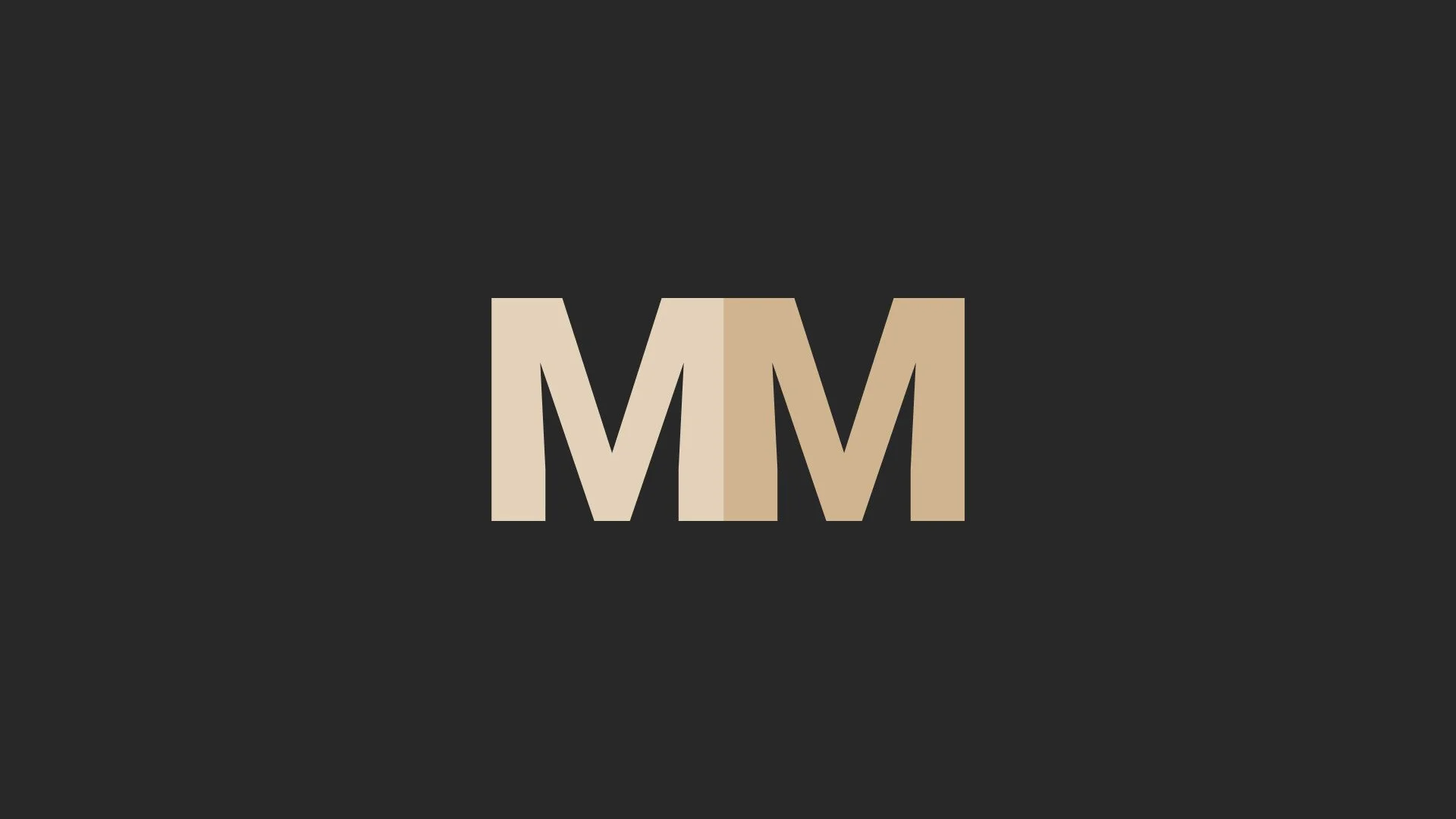
MM - Brand Identity
A clean brand identity designed to establish a professional and modern visual presence.
Overview
MM was a branding project focused on creating a clear and professional visual identity. The work centered on designing a logo and supporting print materials that could be applied consistently across platforms.
The aim was to produce an identity that felt confident, considered, and easy to apply, without unnecessary complexity.
The Problem
Required a professional brand identity suitable for real-world use
Needed a logo that worked reliably across print formats
Visual language had to feel clean, confident, and consistent
Identity needed to be simple enough to scale without losing clarity
The Approach
The project focused on clarity and usability rather than visual excess.
Key considerations included:
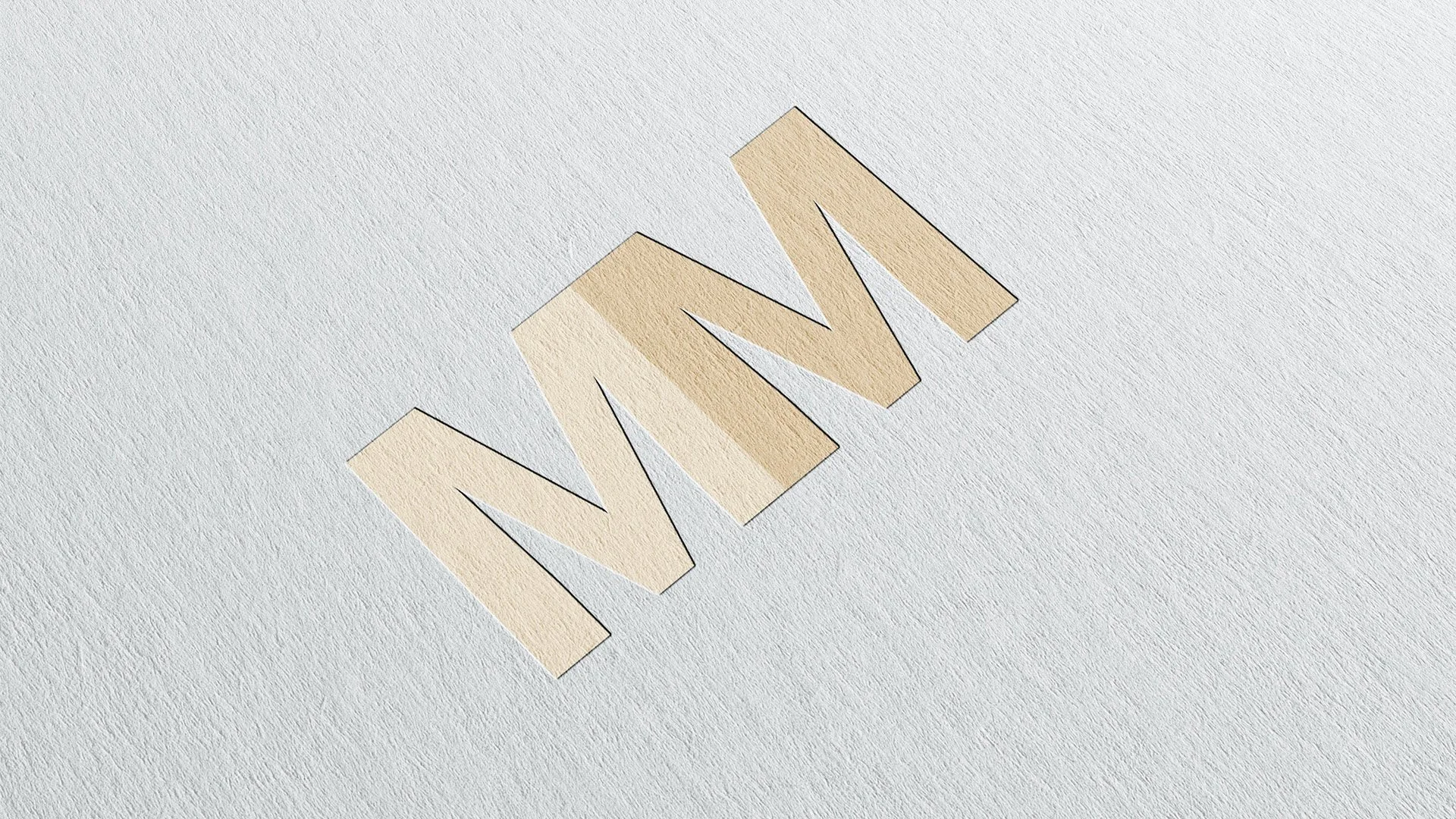
Designing a simple, recognisable logo
Creating a visual style suitable for print
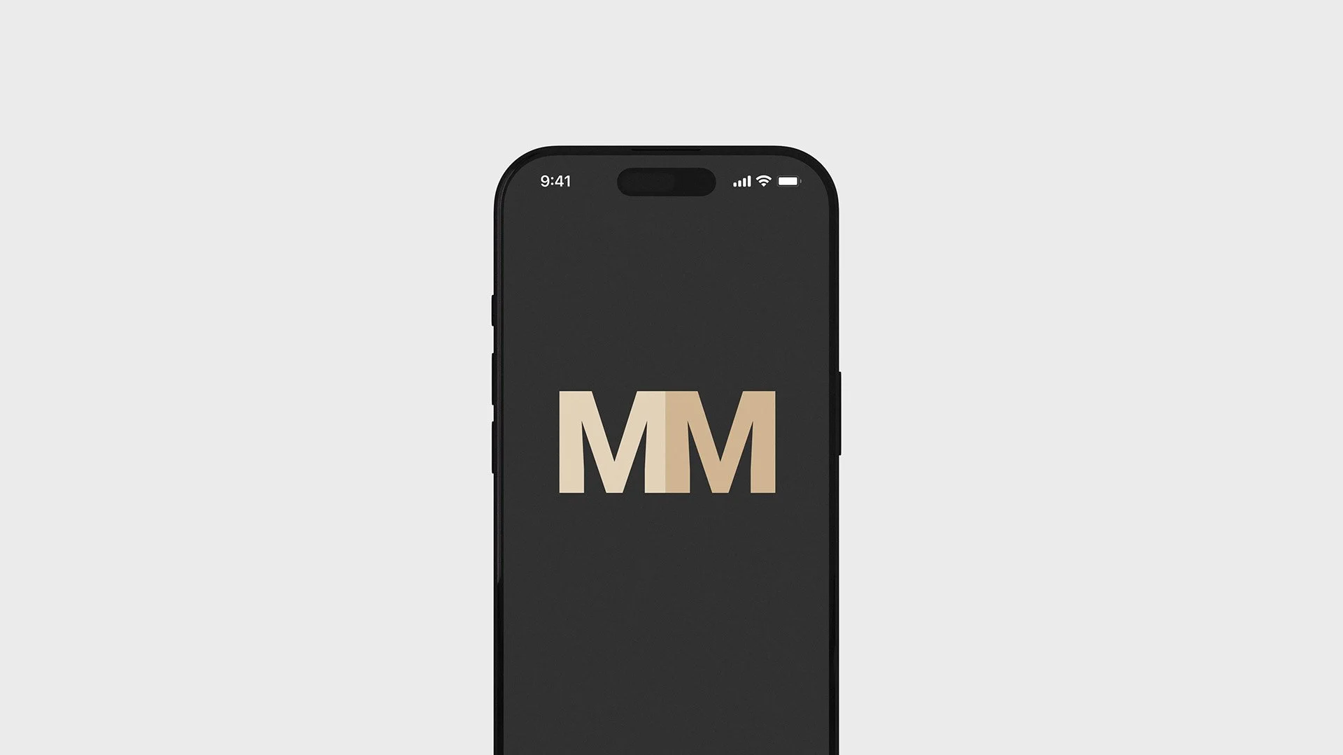
Maintaining consistency across all mediums
Every decision was made with practical use in mind, particularly how the brand would appear on printed material
Design & Build
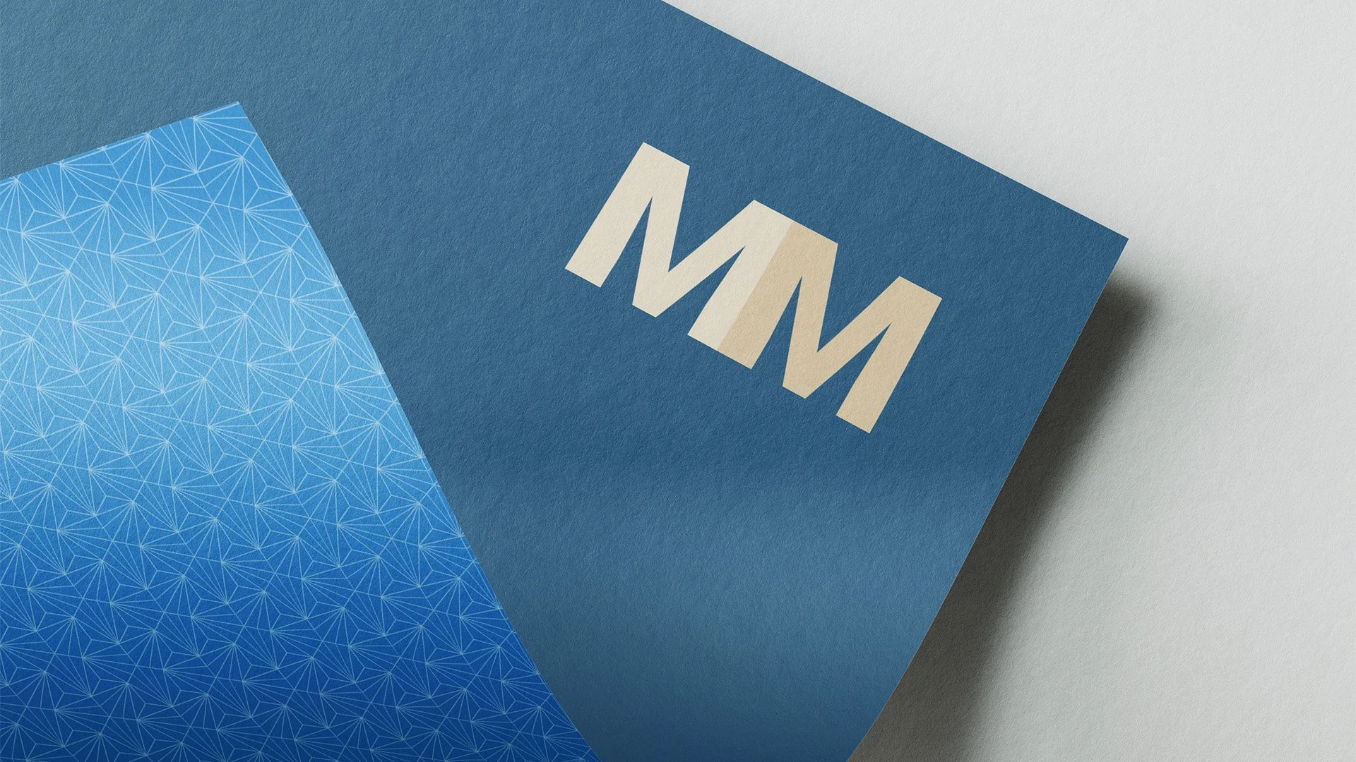
The identity was built around a clean logo supported by a minimal visual system.
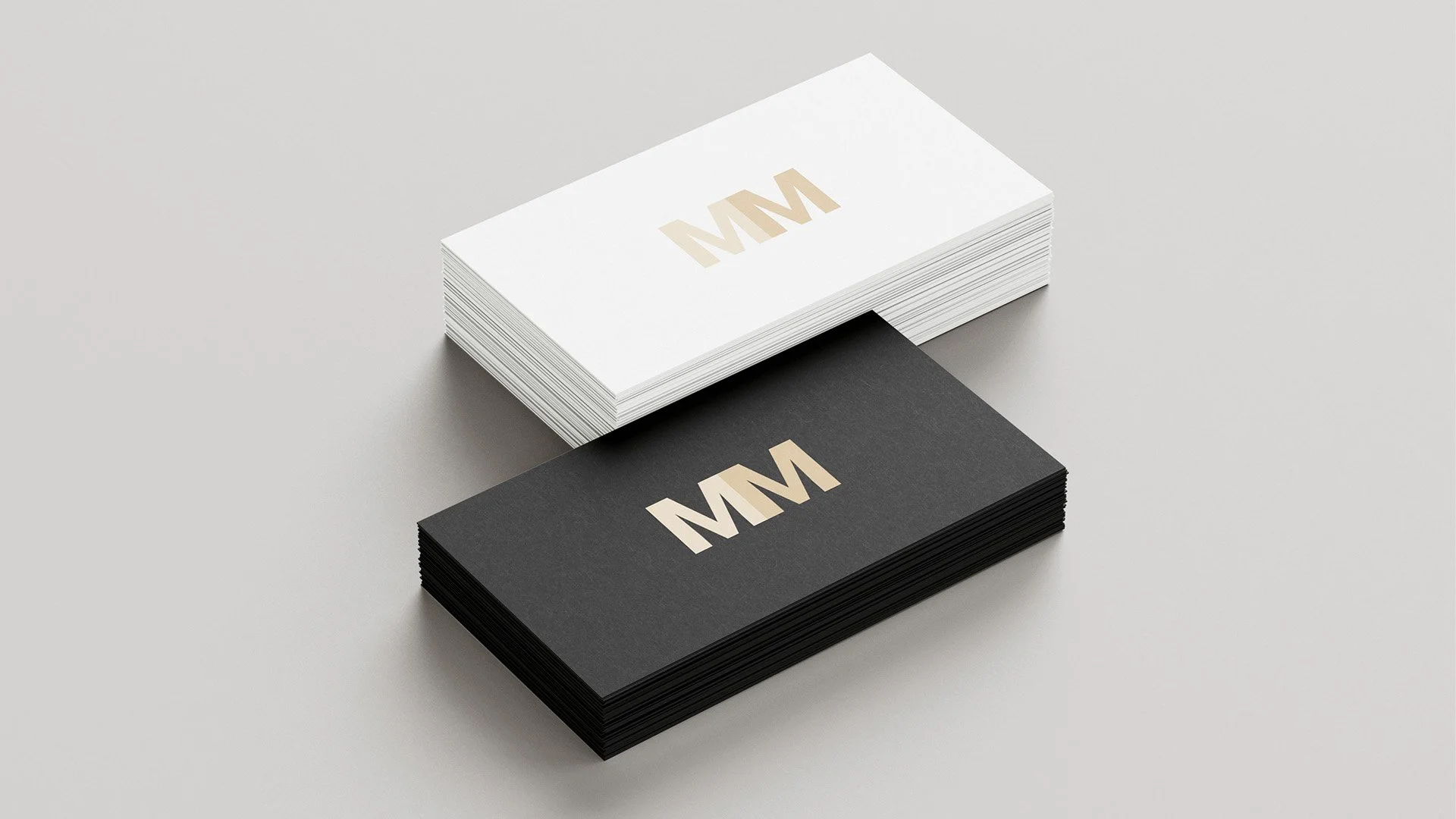
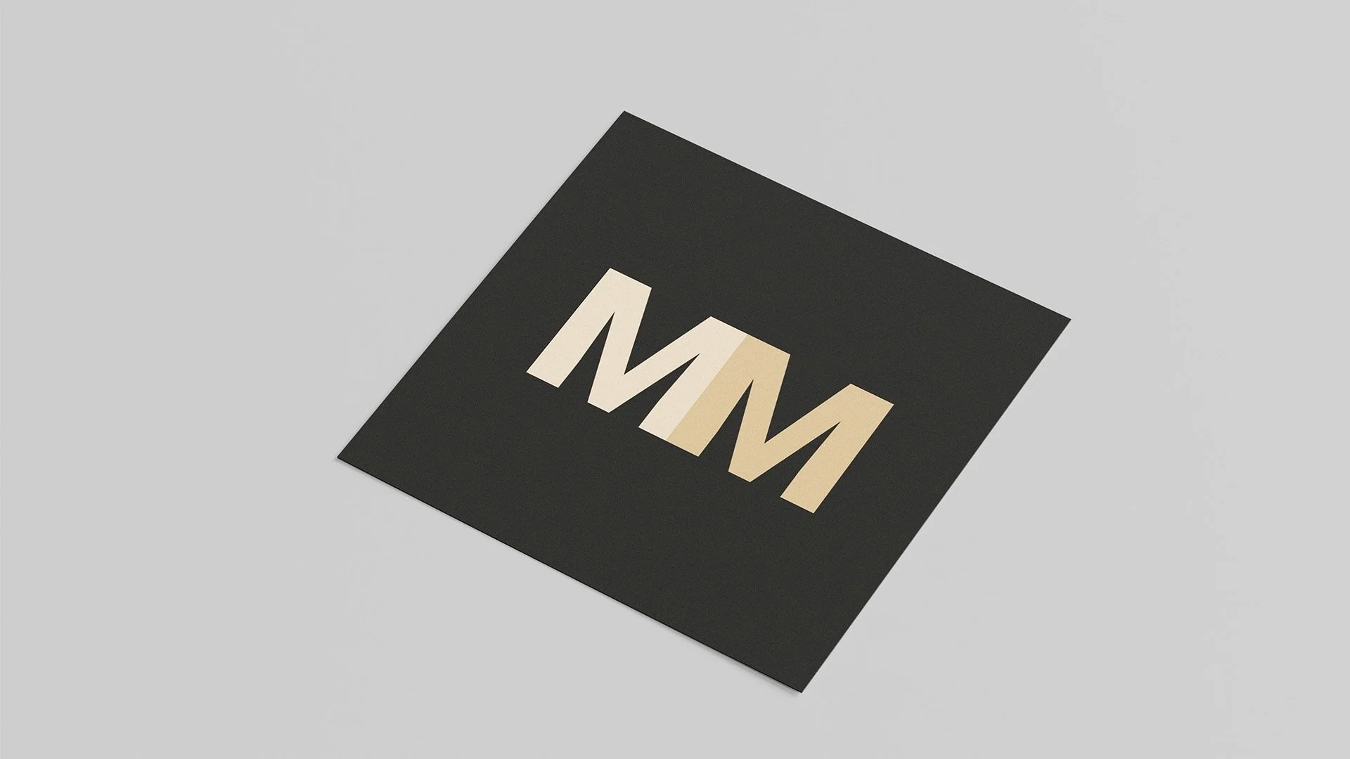
Typography, spacing, and layout were carefully considered to ensure the brand felt balanced and professional when applied to print materials. Business cards were designed as the primary application, serving as a true test of the brand’s clarity and consistency.
The result was a flexible identity that translated well from concept to physical output.
Outcome
The final brand identity provided a clear and professional foundation for MM. The logo and supporting materials worked cohesively across print applications, reinforcing a consistent and confident brand presence.